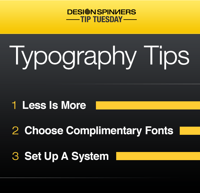
Here are a few of our top typography tips!
- Less is more
It’s important to choose a few main fonts for your project and not get carried away with too many options. Having a few fonts will help them stand out; having too many fonts will cause all the text to get lost in the mix.
- Complimentary fonts
While too fonts may have a similar style, that doesn’t necessarily mean they go together. Using two fonts that look almost identical might end up looking like it was a mistake. A good rule of thumb is to pair together a serif and sans-serif font.
- Set up a system
Choose a font for the body copy, the main headlines, and the sub headlines in your marketing collateral, and use them consistently throughout. This helps the reader visualize the content structure and be able to navigate the copy much easier.